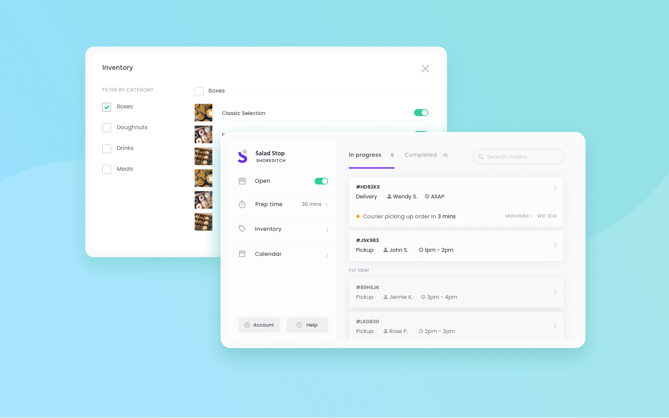
A customer journey for online food ordering
UI/UX Design
Web Development
Landing page
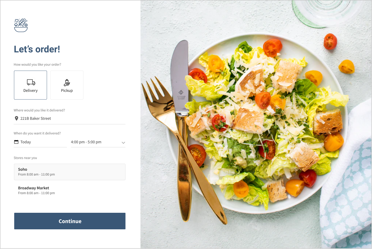
This page is where the customer starts ordering. They start by choosing their fulfillment type, whether delivery or pickup, and from there they can select the date and time they want their order, and which store they want to order from.
After choosing the necessary details, the user will then be redirected to the products page.
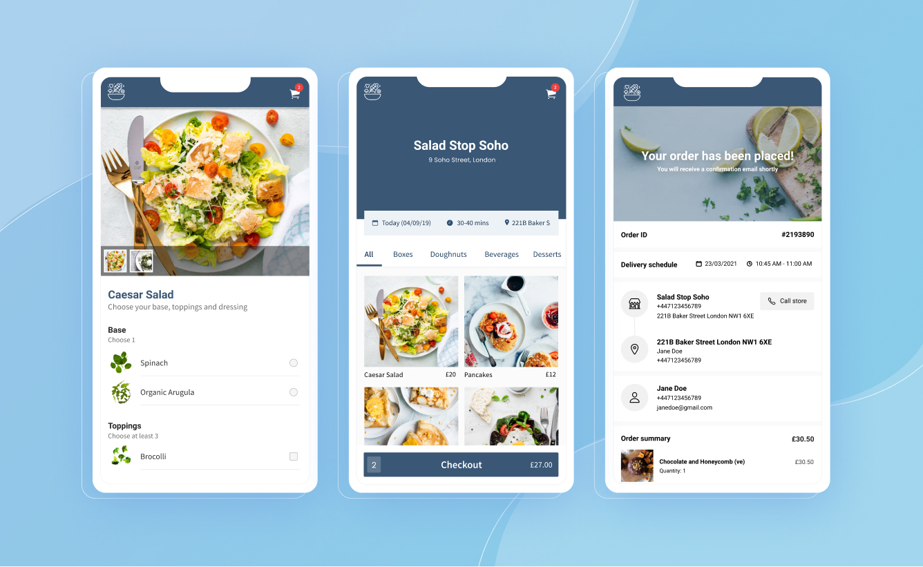
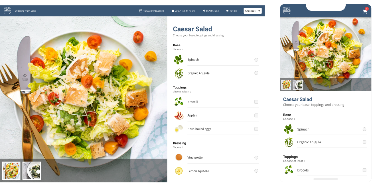
Product pages
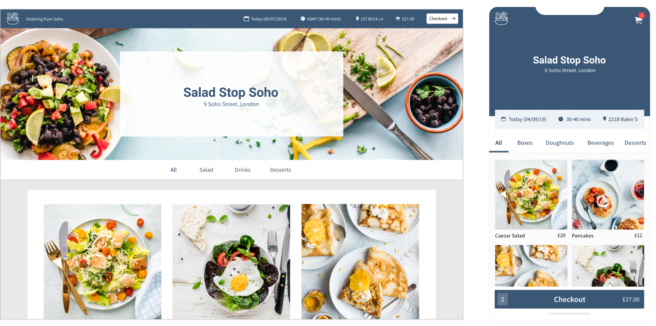
The products page contains all of the available products from the user’s chosen store.
The information in this page was organized in a way that the order details such as date, time, and store they are ordering from are visible to the user while they choose the products to add to their carts.
Checkout page
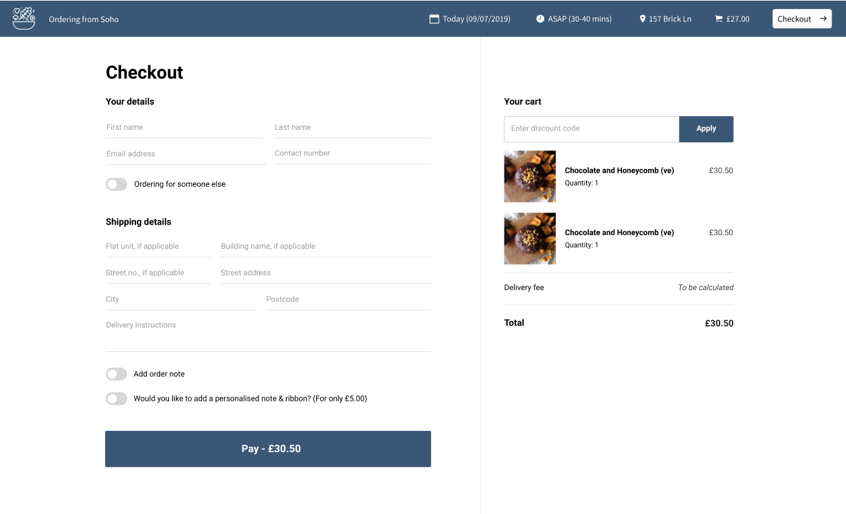
Simplifying the checkout page
The first version of the checkout page (as seen below) was redesigned to make it cleaner and simpler. Fields that were optional and rarely used by users were collapsed by default.
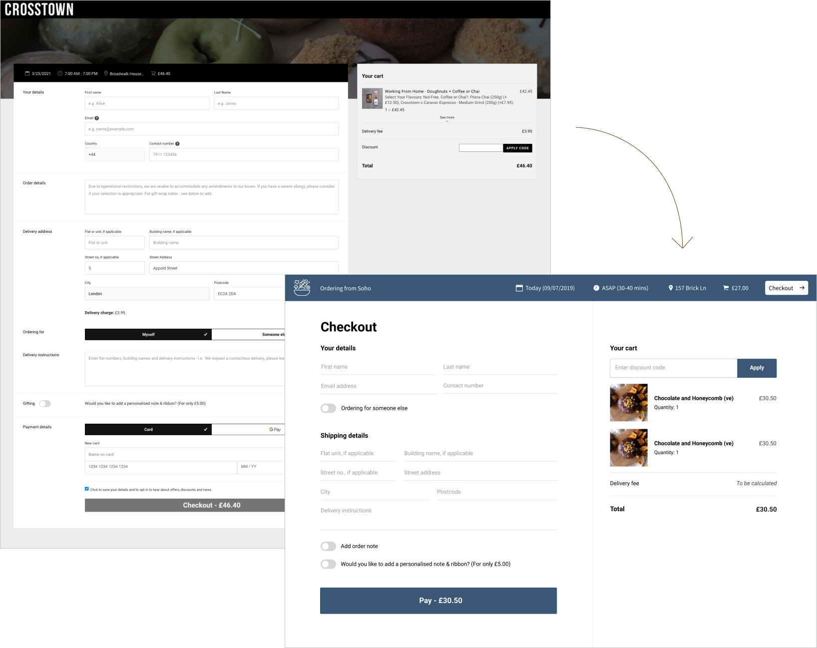
One of the areas that was improved in the redesign was the form structure. As seen on the image above, the previous checkout form had too many fields and options that are being displayed to the user.
I decided that it would be best to simplify and shorten the current form structure because that would allow the user a smooth and faster checkout.
Key improvements:
- Making order notes togglable - Based on the Slerp’s historical data, I found out that only ~10% of the orders have order notes, meaning this field is not being used by users that often. I decided to replace this field with a switch (off by default) to shorten the checkout form. As customers who would actually want to use this, will eventually find their way to it because they need to.
- Dropping the country code prefix for better autofill compatibilities.
- Converting “Ordering for myself/someone else” tabs into a switch - UI wise, the visual hierarchy of the colored tabs makes this field stand out more than it needs to. UX wise, converting it into a switch, together with the copy changes, makes the whole thing more intuitive.
- Migrating payment to Stripe for the users to be able to complete transactions very quickly if they already have an account in Stripe.
Order page
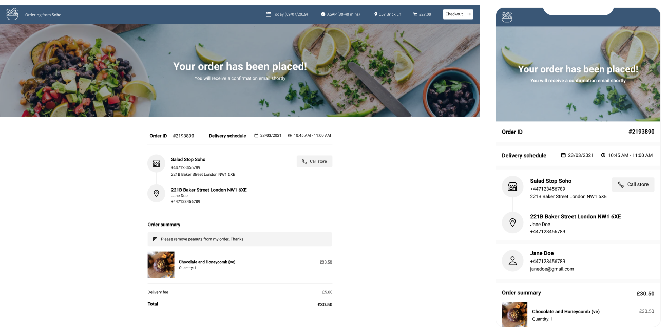
I added two small but useful features that improves the order page experience. First is the "Call store" button that allows the user to call the store and the "Get directions" button that redirects the user into a map view of the exact store location. This is useful for pickup orders as the customer would need to get the order from the store themselves.