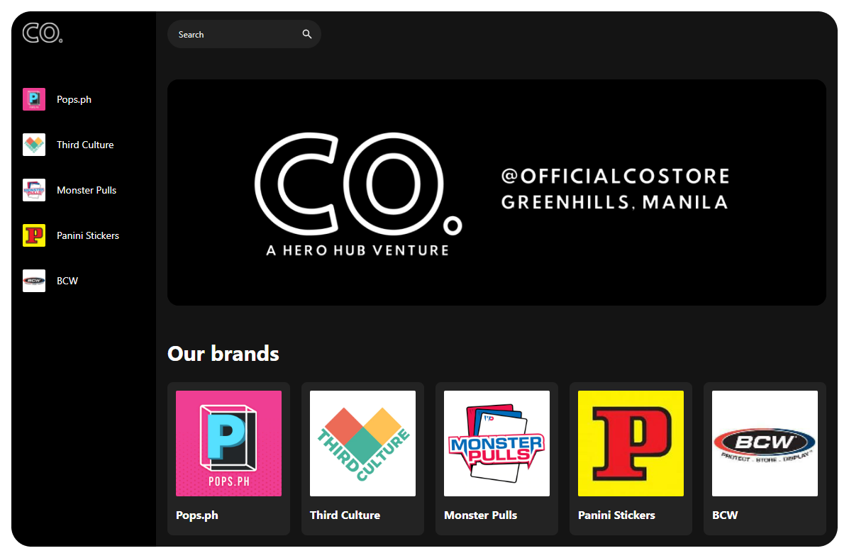
An in-store digital binder for a collectibles store
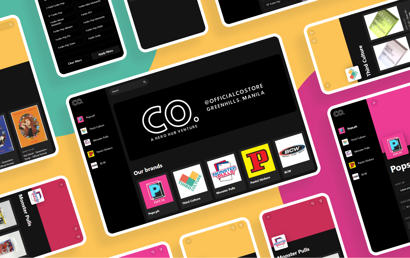
Some collectibles are common, some are very rare. The rare collectibles can sometimes value up to 8000 USD. These can’t be displayed in store as it can pose risk to theft, thus the main reason this project was created. The idea was to have tablets inside the store that can be used by the customers to browse the items in the store without having to search the whole area.
UI/UX Design
Web Development
Research and brainstorming
Main goals
The goals were set by the client from the beginning of the project.
It was to create a digital binder that:
- Allows the customer to search through the catalog easily
- Contains all the relevant details about the product that the customer need
- Can double as an online ordering platform
Solutions
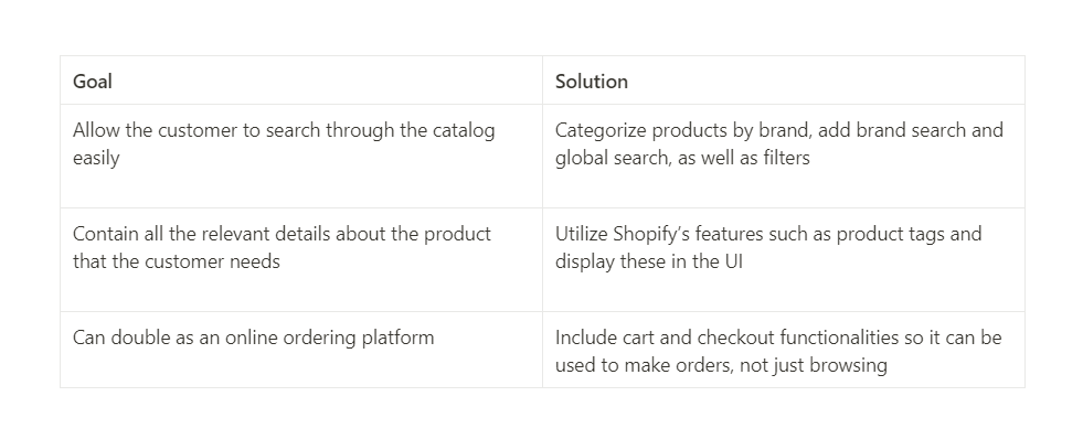
Since the problems were already defined from the start, I listed the initial solutions I thought of for each goal. With a short timeline, most of these were based on assumptions but with the intent of testing a prototype as soon as possible with actual customers inside the store.
Sitemap
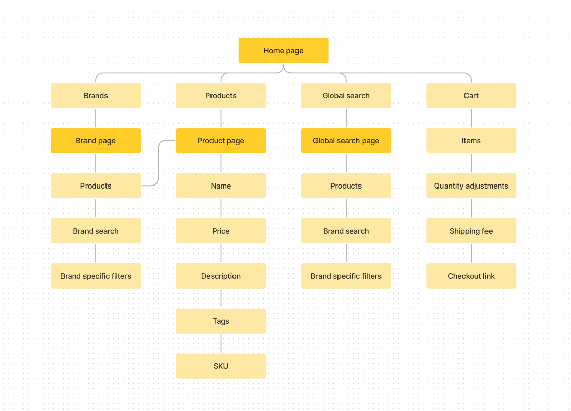
After thinking of the initial solutions, I created a sitemap that'll help me construct the user flow. The blocks with vibrant yellow colors are the main pages.
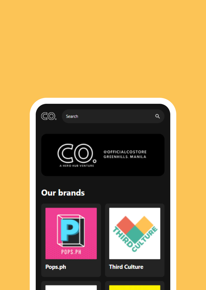
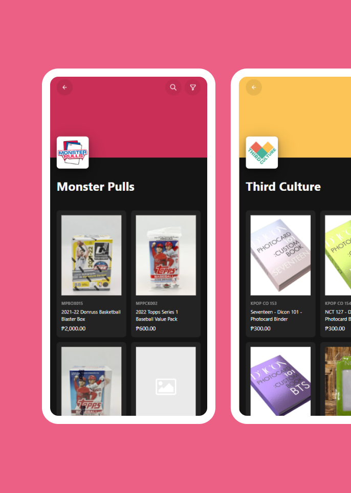
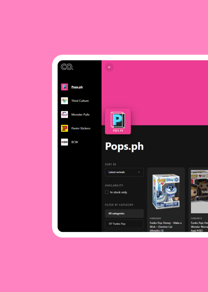
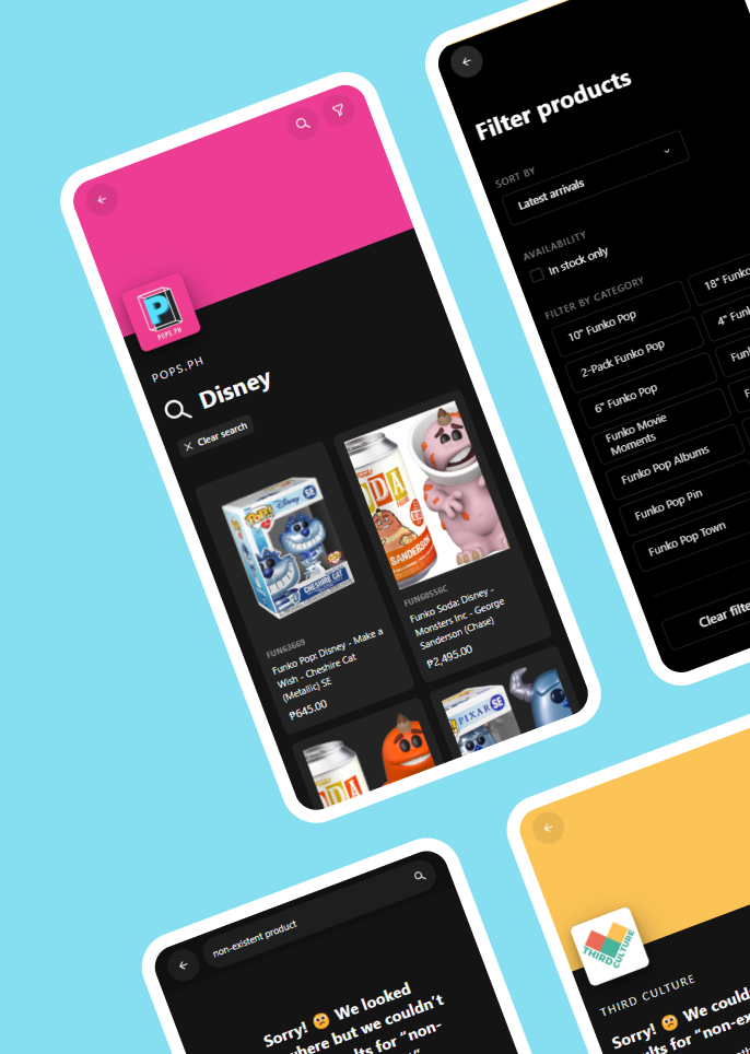
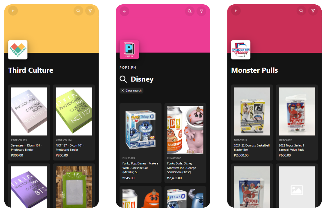
The homepage will contain the brands, some products, global search and access to the cart. The brands will each have their own pages to have a better categorization of products. In the brand page, there will be products, brand-speific search and filters. The product page will of course contain all the relevant information such as description, tags and sku.
Initial design and prototype
Low fidelity mocks
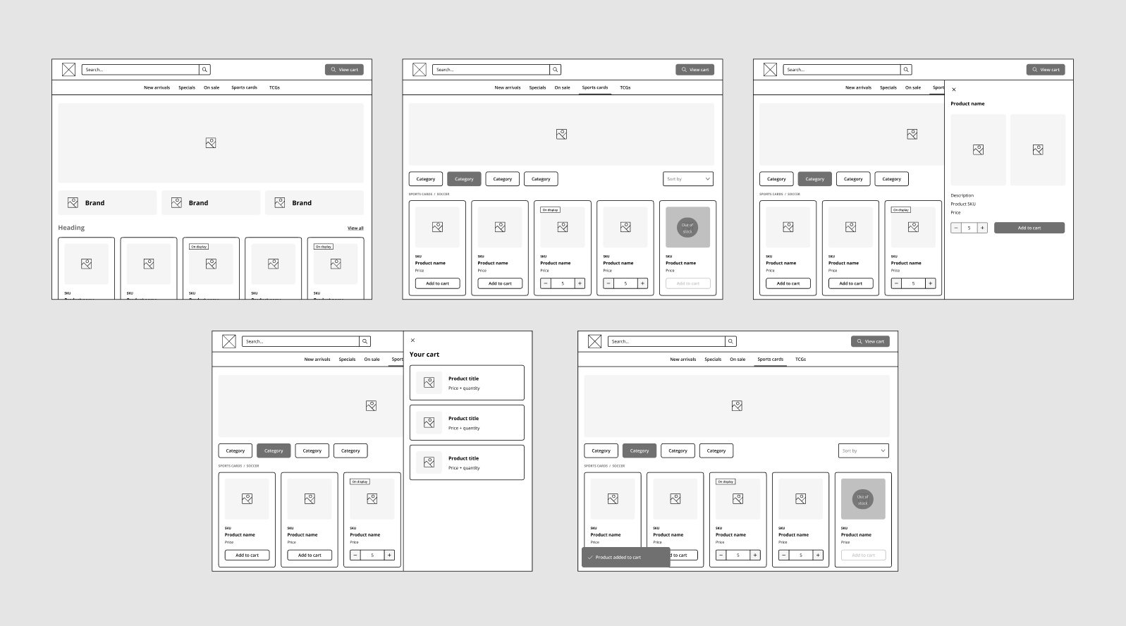
With the help of the sitemap and userflows I created, as well as Figma plugins I found for making lofi mocks, working on the low fidelity mocks was a breeze. Below is the initial shape and structure I envisioned for the product.
Initial prototype
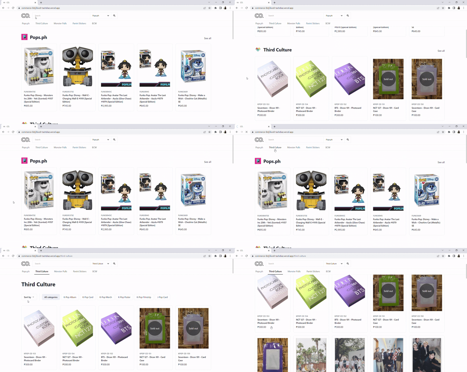
With the short timeline, I had to build a prototype as soon as I can to test the designs. It didn't look pixel perfectly close to the lofi mocks, but it was more important for me to get feedback early so that I can quickly fix and improve the product.
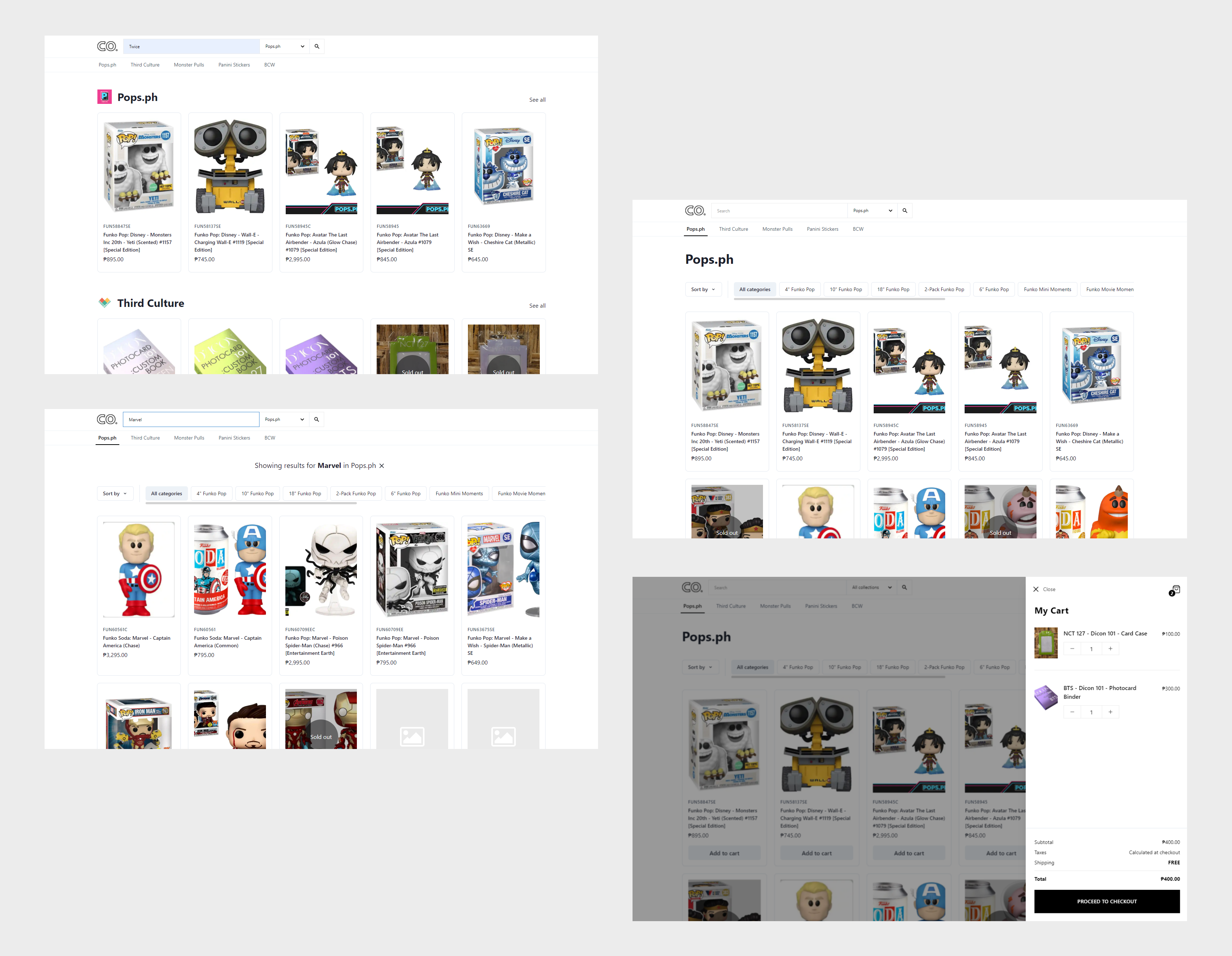
Below is a gif and a few screenshots of the first prototype I made. This was fully functional, built with code.
View prototype site 🡥
User testing
The prototype was tested in the store with actual customers the next day.
The feedback was generally good. The customers were happy and excited. They liked the idea of having a digital binder as it makes the shopping experience much easier.
Here are some of the feedback gathered:
The category filter on the brand page - It wasn't expected that there will be a lot of category filters added to the brand page. Long category lists were handled by making the list scrollable. This was generally confusing to the users as it can be easily missed as there aren't really any scrollbars on touch devices that could visually indicate something is scrollable.

A gif of the scrollable category filter list
After getting this feedback, I decided to change the layout of the brand page and move the category filters to the left side of the page. It made more sense as having a vertical list scales better than a horizontal one.
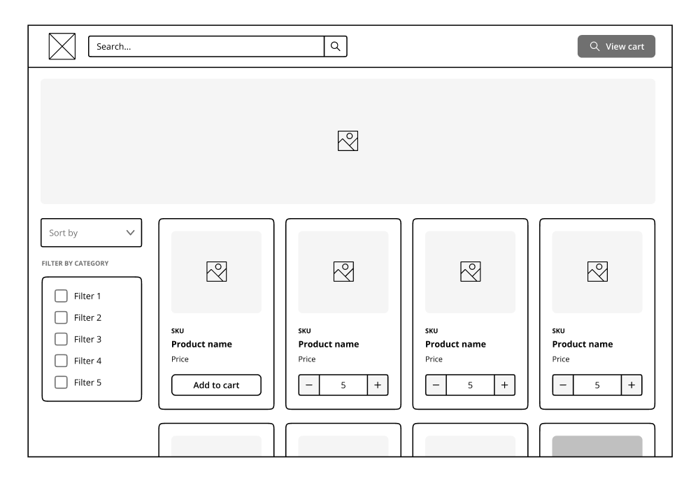
Lofi mock of the new brand page layout
The global search on the navbar - It was found unintuitive to use the brand filter dropdown on the right of the search bar. I changed the app's search structure to have a global search bar on the navbar that searches the whole site, and then have a search bar on each of the brand pages that only searches through that.

The final product
After some iterations and continuous UX improvements, the app was ready for the final rollout. Below are some photos of the app shown on the tablet in the store.
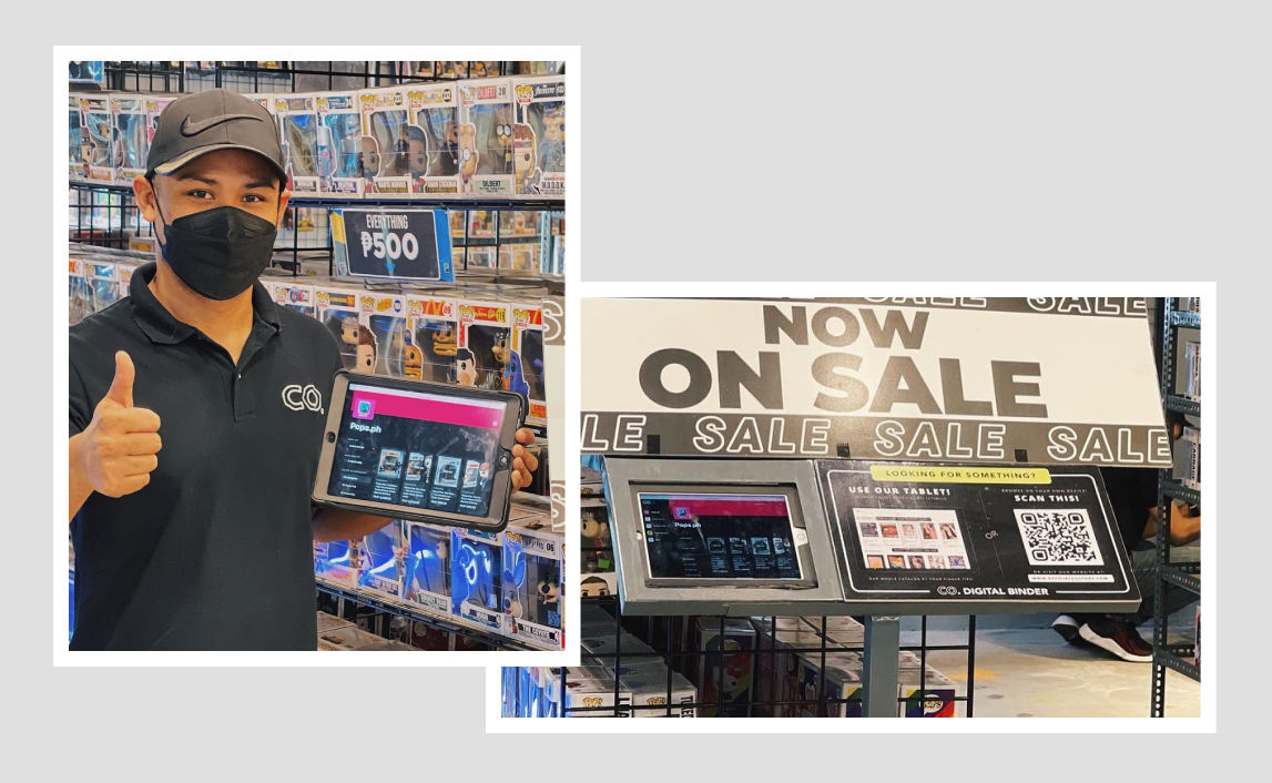
Product screens
