An order and inventory management mobile app
UI/UX Design
Dashboard page
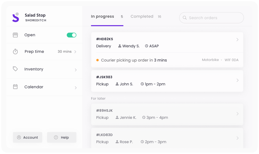
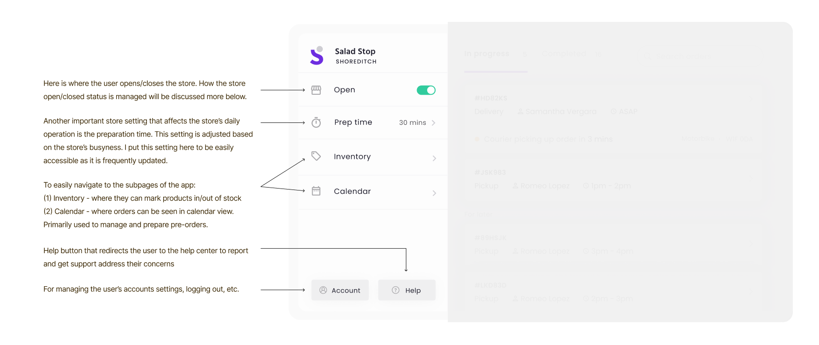
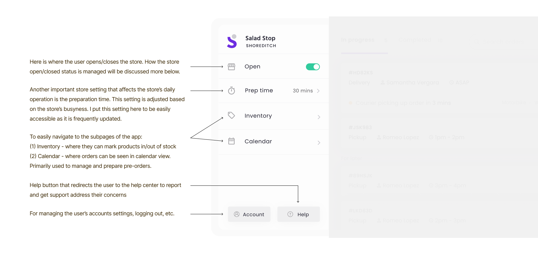
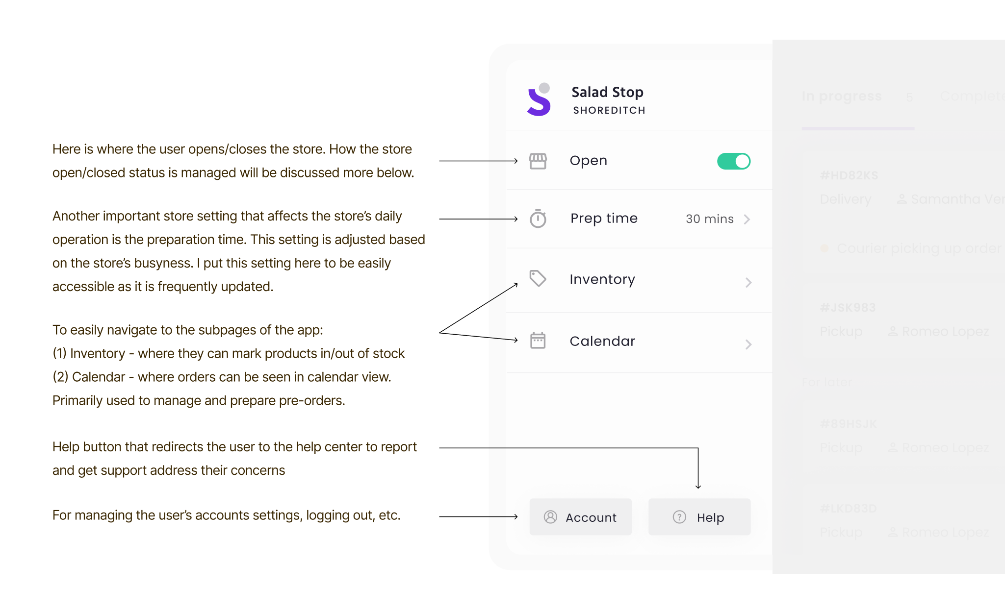
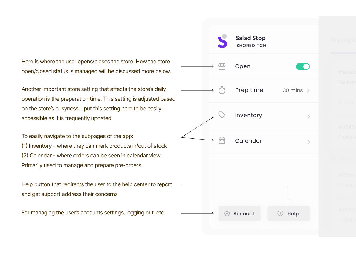
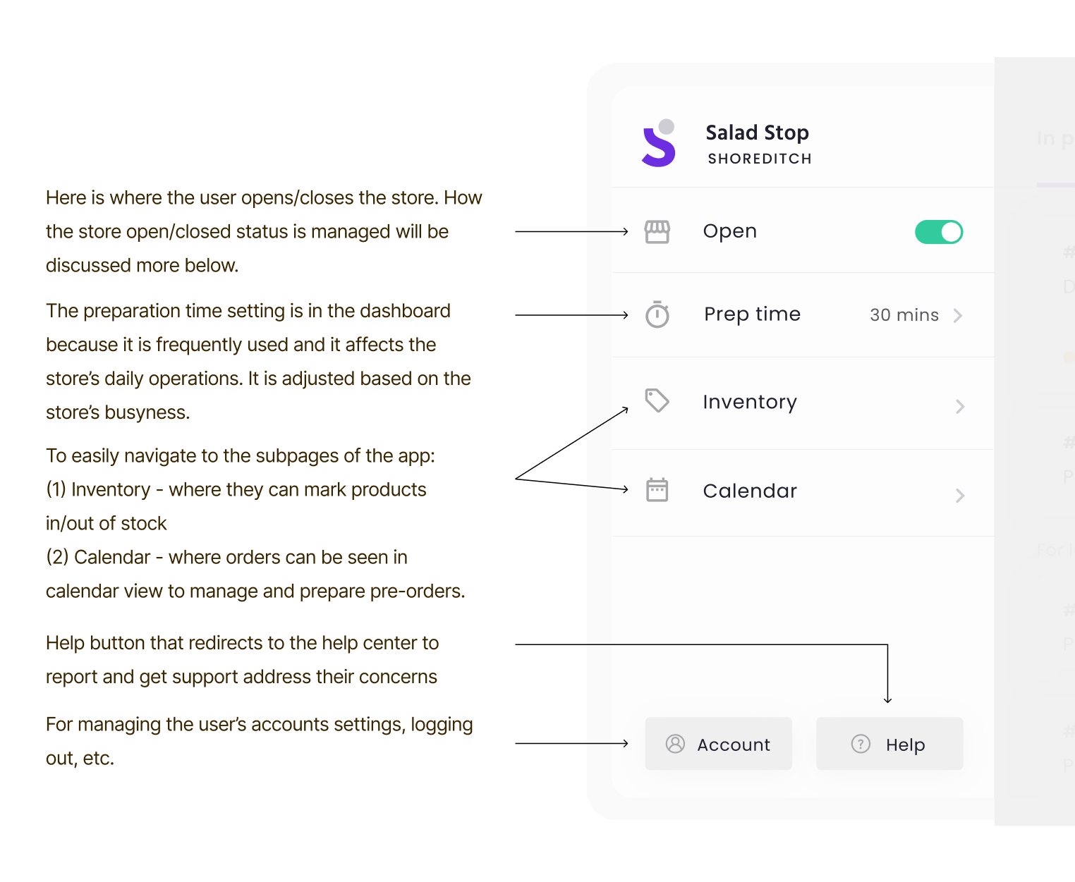
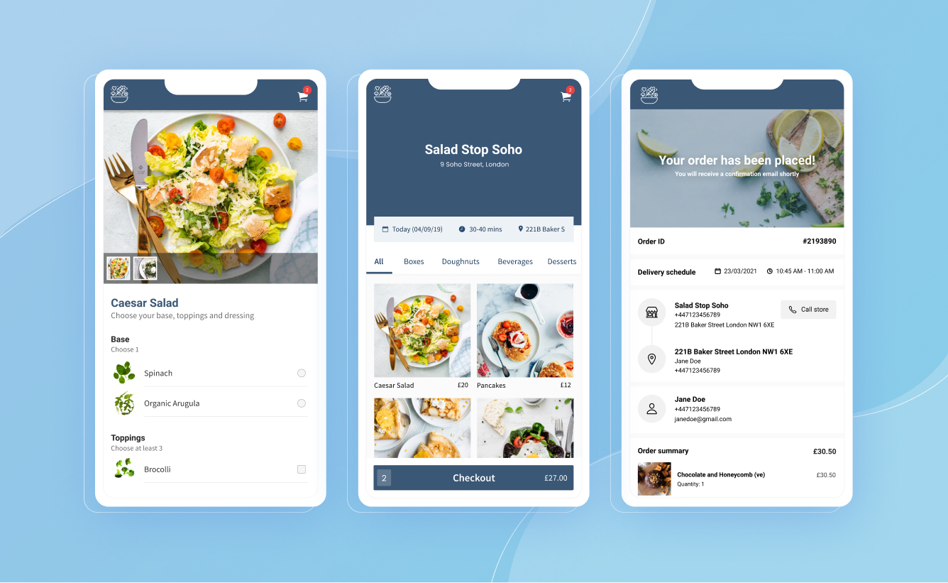
One of the major goals when I was designing is to make everything important accessible within the dashboard. In this page they can easily manage the upcoming orders, edit their prep time, open and close their stores, and navigate to the inventory and calendar pages.
Here’s a breakdown of the features in this dashboard, details of the design decisions made, and just basically how everything came to be.
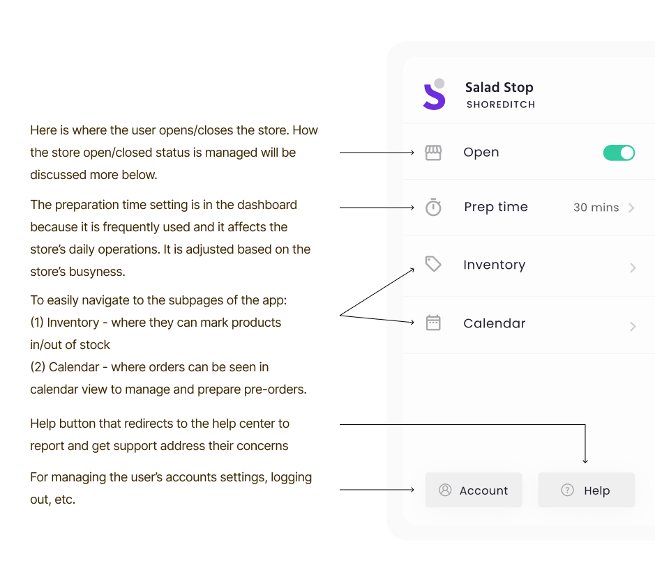
Designing the side navigation
Creating a seamless order management experience
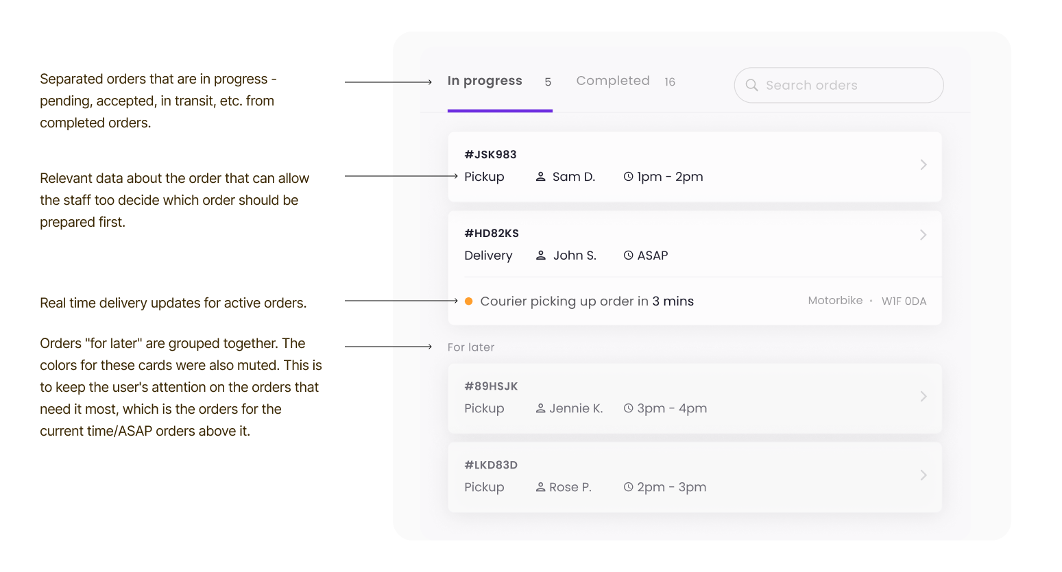
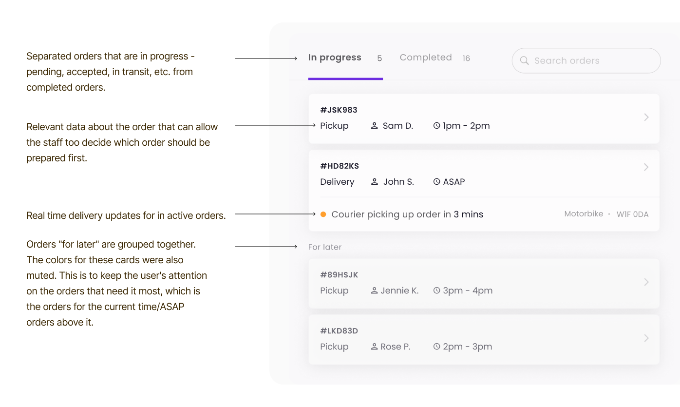
Looking for orders on the app's first version wasn't always an easy task according to some of our users. Orders can easily get lost in the list especially on busy days. To improve this, we had to identify what was making it difficult.
The first problem identified was the way the orders were sorted. They were sorted based on when the order was placed, which didn’t make that much sense because an order placed at 9am can have a 5pm fulfillment time. What made more sense is that orders that needed to be prepared at the current time should be what the user is seeing first. ASAP orders and the scheduled orders for the current hour are on the top, while all the orders for later at the bottom.
Inventory page
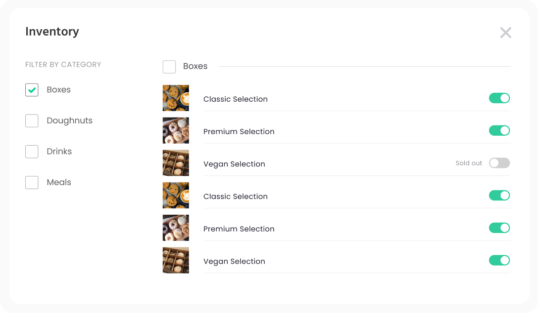
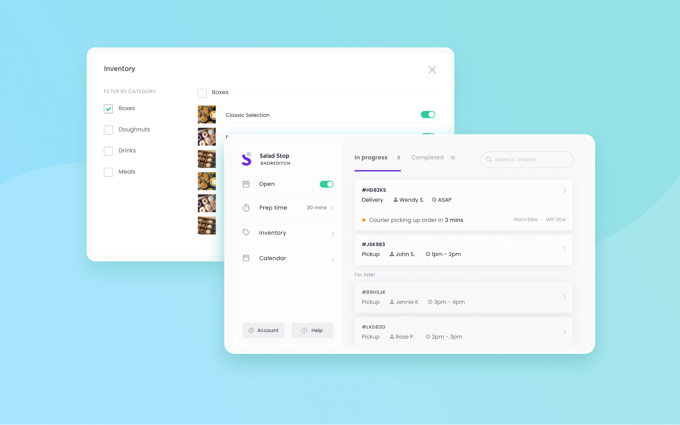
Another core functionality of this app is managing the store’s inventory. The products were laid out without grouping and that made it hard for the users to mark items in stock especially for bulk edits. To improve the experience of marking products in and out of stock, the products have been grouped according to their category. This way, all the products under a category can be edited in one click.
A category filter and search was also added to easily find products. Since the products are grouped by category, users can edit the availability of products belonging to the same category.
